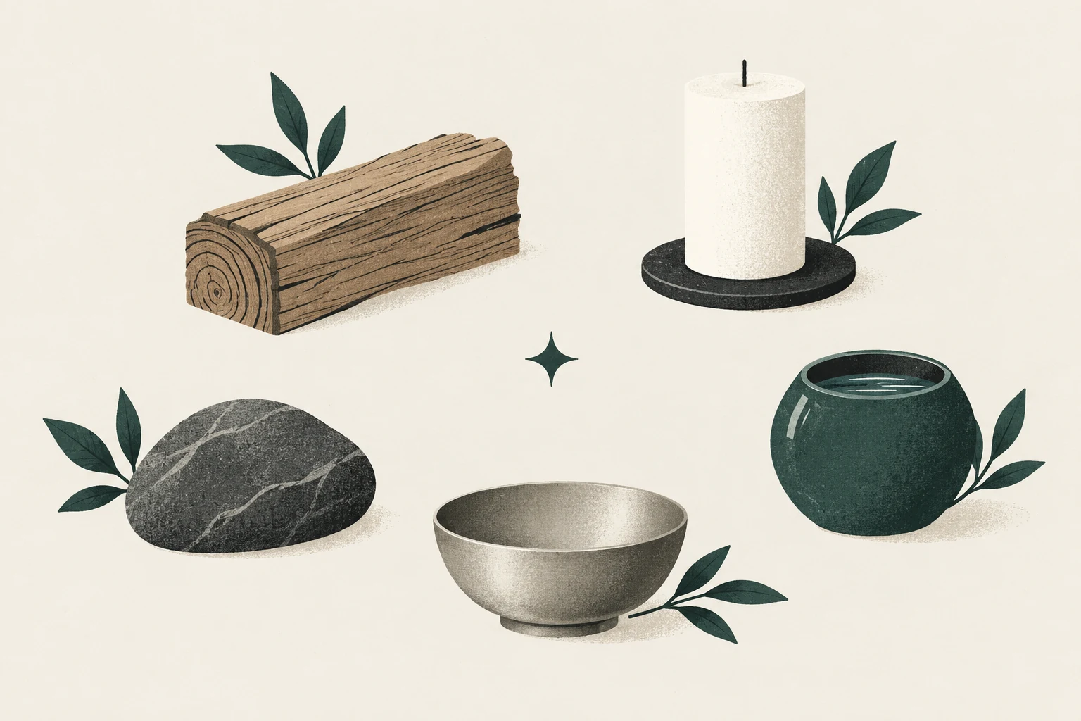
The “five elements” of feng shui are better understood as five phases—wood, fire, earth, metal and water—used in Chinese thought to describe qualities, relationships and patterns of change. They are not five substances every living room must display.
That distinction matters. A checklist approach can turn the framework into five colours, five ornaments and more clutter. A room-first approach looks at material, shape, colour, light and use together, then makes the smallest adjustment that clarifies the composition.
Smallest useful action: Choose the room’s most visually dominant material. Name what it contributes—warmth, weight, reflection, vertical lift or movement—before deciding anything is “missing.”
What the five phases describe
The Stanford Encyclopedia of Philosophy explains wuxing as wood, earth, fire, water and metal within cyclical patterns of generation and overcoming. “Phase” emphasizes process and relationship. Modern feng shui schools apply those associations to rooms in different ways, so a one-size-fits-all correction is unlikely to represent every tradition.
For practical interior observation, the following correspondences can work as prompts:
| Phase | Often associated with | Common room cues | Question to ask |
|---|---|---|---|
| Wood | growth, upward movement | timber grain, plants, vertical forms, green/blue-green | Does the room need lift or living texture? |
| Fire | activity, visibility, warmth | flame, strong light, points, red/warm accents | Is there enough focus and social warmth—or too much stimulation? |
| Earth | grounding, support | clay, stone, low square forms, ochre/warm neutrals | Does the seating group feel anchored? |
| Metal | precision, definition | metal, circles, whites and greys, crisp edges | Would clearer structure help? |
| Water | flow, depth, reflection | glass, dark tones, curved or irregular forms | Does the room need visual depth or a gentler route? |
These are associations, not scientific properties or guaranteed outcomes.
Read colour, shape and material together
A green plastic object is not the same design experience as a healthy plant; a black rectangle may read more strongly as a television than as “water.” Context matters.
Look at each large item in three ways:
- Material: What is it physically—timber, wool, glass, stone, steel, laminate?
- Form: Is it low, vertical, round, angular, soft or reflective?
- Colour and light: Is it visually dark or light? Matte or glossy? Does daylight change it?
Then include function. A metal reading lamp may contribute definition, but its main value is useful light. A timber coffee table may suggest wood-phase qualities, but it also anchors the seating group. Function keeps symbolic reading connected to the room people actually use.
Notice excess before adding objects
When a room feels unbalanced, adding the opposite “element” is not always the answer. First identify repetition.
Too much upward or busy visual movement
Many tall shelves, plants and vertical patterns can make a room feel active. Try clearing one shelf, grouping plants instead of scattering them, or strengthening the low horizontal line of the sofa and rug.
Too much visual heat
Strong warm colours, bright lamps, an active television and a fire can compete. Reduce simultaneous focal points, improve dimming and move one vivid accent out of the main sightline. Do not introduce a water feature as an automatic cure; it creates maintenance, spill, electrical and pet considerations.
Too much weight
Stone, dark upholstery and blocky furniture can feel stable but visually dense. Improve space around the pieces, lift curtains, add a lighter textile or use a reflective detail only where it will not create glare.
Too much precision
An all-grey, hard-edged room may feel orderly yet impersonal. Soften it with texture, an irregular handmade form or one living plant suited to the conditions—not with a shopping spree.
Too much reflection or visual depth
Glass, mirrors, glossy surfaces and dark screens can multiply movement. Cover, relocate or simplify one reflective plane. The mirror guide helps evaluate what a mirror actually repeats.
Build a restrained material plan
Choose one dominant material family, one supporting family and one small contrast. For example:
- Dominant: warm timber and woven fibre;
- Support: matte ceramic and plaster-like surfaces;
- Contrast: a small dark metal lamp.
Or:
- Dominant: upholstered and soft surfaces;
- Support: pale timber;
- Contrast: one glass or metal table detail.
This is not a prescribed elemental formula. It is a way to keep the room coherent while allowing different qualities to appear.
Worked reading: a grey room with timber floors
A room with a grey sectional, metal media unit and timber floor already contains several qualities. The floor brings grain and warmth; the sofa and media unit create a cool, precise field. Before adding a red “fire” object, try a warm lamp that reveals the timber and a textured cushion already owned. The adjustment changes the relationship among existing materials without pretending that one missing colour caused the room’s discomfort.
Use what you already own
Before buying an “element” object:
- move a lamp to make existing texture visible;
- group scattered ceramics into one intentional composition;
- uncover the grain of a table buried under objects;
- rotate a textile from another room;
- prune or relocate a healthy plant to suit actual light;
- leave one surface open as part of the design.
The living-room colour guide shows how to test a palette against daylight and fixed finishes. For object placement, use the decor hub.
Five questions instead of five purchases
- Where does the eye move upward or outward?
- Where does attention become active or warm?
- What makes the seating group feel settled?
- Which line or boundary creates clarity?
- Where does reflection, depth or curved movement appear?
Your room does not need equal answers. Balance is contextual, not a pie chart. A timber-floored room can still benefit from wood; a metal-rich room may be exactly right for the household. Observe the whole composition and the people using it.
Sources and editorial note
Cultural context is grounded in the Stanford Encyclopedia of Philosophy’s Chinese metaphysics entry and its discussion of wuxing as phases in cyclical change. Interior applications and correspondences vary by feng shui school. This guide uses them as design prompts and makes no claim that a material or colour produces health, wealth or relationship outcomes.