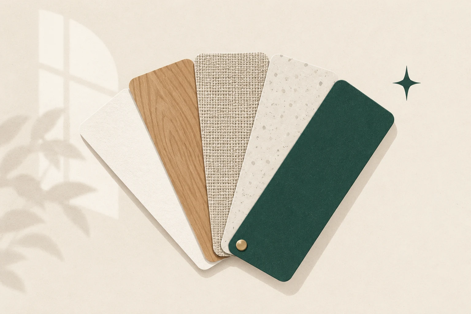
The most supportive living-room palette is rarely the one copied directly from a direction chart. It is the one that works with the room’s daylight, fixed finishes and everyday purpose—and then uses feng shui associations as a thoughtful second lens.
Start by noticing what is already present. The floor, large sofa, fireplace, built-ins and window exposure carry more visual weight than a new cushion or vase. A room can feel unsettled when those large surfaces compete, even if every individual colour is supposed to be “good feng shui.”
Smallest useful action: Put every portable colour sample in a drawer for a moment. Photograph the room in morning, afternoon and lamplight. Circle the two fixed colours that dominate all three views.
Start with daylight and fixed finishes
Daylight changes colour. A warm off-white may look quiet beside a north-facing window and yellow beside strong late-afternoon sun. Glossy paint, television screens and mirrors also bounce light in ways a small sample cannot show.
Make a short room inventory before choosing a palette:
- Light: Which wall receives direct sun? Which corner stays dim? Is glare a problem?
- Fixed finishes: Note the floor, stone, timber, fireplace tile, trim and built-ins.
- Large furniture: Record the sofa, rug and media unit as colours, not product names.
- Purpose: Is this mainly a conversation room, television room, play space, reading room or passage between other areas?
- Desired quality: Choose one plain-language aim such as grounded, sociable, bright or restful.
This inventory prevents a common mistake: adding more colour when the room actually needs clearer lighting or fewer competing finishes. Our guide to living-room lighting can help if a “wrong colour” only appears wrong after sunset.
Use five-phase associations without a rigid formula
Feng shui often relates colours, shapes and materials to the five phases—wood, fire, earth, metal and water. “Phases” is a more useful translation than treating them as five literal substances: the framework describes relationships and change, not a shopping list. The Stanford Encyclopedia of Philosophy describes wuxing as wood, earth, fire, water and metal within cyclical patterns of generation and overcoming.
In a contemporary living room, practitioners commonly read the associations together:
| Phase | Common colour cues | Shape or material cues | A restrained way to explore it |
|---|---|---|---|
| Wood | greens, blue-greens | vertical forms, timber, plant growth | one healthy plant or visible timber grain |
| Fire | reds, warm oranges, vivid light | points, flame-like forms, active pattern | a small warm accent or brighter social light |
| Earth | ochres, sand, warm neutrals | low horizontal forms, clay, stone | a ceramic bowl or substantial low table |
| Metal | whites, greys, metallic tones | circles, precision, metal | a round tray or simple metal lamp |
| Water | dark blue, near-black tones | irregular or flowing forms, glass | a dark frame or gently curved detail |
Associations vary by school and practitioner. They are not proof that a colour will create wealth, health or relationship outcomes. Use them to ask better visual questions: Does the room need more lift, warmth, weight, clarity or softness? Read the fuller five phases guide before making an “element” purchase.
Build a practical three-part palette
A simple palette is easier to live with than a collection of auspicious colours.
- Choose a field colour. This is the quiet background carried by walls, a large rug or the sofa. It should cooperate with fixed finishes.
- Choose a supporting colour. Repeat it two or three times at different heights so it feels intentional rather than stranded.
- Choose one small accent. Use it where attention is useful: a chair, artwork detail or cushion near the conversation area.
The proportion does not need to be mathematically exact. The field should clearly lead, the support should be noticeable, and the accent should remain small enough to edit later.
If the room feels dark
Do not assume white paint is the whole answer. First clean the window, remove objects that block useful daylight, and add task light where people read or work. Then test a lighter, less reflective wall colour. A large mirror is not automatically the solution; it can duplicate glare or a cluttered view. See how to place mirrors before adding one.
If the room feels cold
Temperature is visual as well as physical. Timber, woven texture, warm-neutral surfaces and shaded lamps can soften a cool scheme without repainting everything. Add one change and observe it in all lighting conditions.
If the room feels busy
Repeat fewer colours rather than buying matching sets. Turn book spines, toys and daily objects into part of the inventory instead of pretending they disappear. Closed storage can reduce visual noise, but decluttering the living room should begin with what the space needs to support, not with new containers.
Test colour before buying paint
Paint a removable sample board rather than making a tiny patch on one wall. Move it beside the floor, sofa and trim. Check it from the doorway and the main seat in morning, midday and evening light. If possible, live with the sample for several days.
For furnishings, make a no-purchase test first: drape a towel, sheet or garment in a similar colour over the chair or sofa. This is not a perfect colour match, but it reveals scale. A shade that feels pleasant in a small swatch may dominate once it covers two metres of upholstery.
Worked example: a cool rental with a beige sofa
Suppose a north-facing rental has a beige sofa, grey laminate floor and cool white walls. Repainting may be restricted. Rather than adding several warm accent colours at once, start by testing one warm-neutral throw and moving a shaded lamp beside the sofa. Repeat the throw’s tone once in an object already owned. If the room feels more coherent at noon and at night, that small bridge may be enough; if not, the test cost nothing and is easy to reverse.
A room-first colour checklist
- Can you name the two fixed colours already leading the room?
- Does the proposed field colour work in daylight and lamplight?
- Does each added colour have a functional or visual job?
- Are you using a five-phase association as an interpretive prompt rather than a guarantee?
- Can you test the change with a sample, borrowed textile or moved object first?
- Will the palette still work when ordinary possessions are visible?
Colour comes after the room’s route and main seat. If furniture still blocks the doorway or conversation feels awkward, begin with the complete living-room layout guide and return to colour once the plan makes sense.
Sources and editorial note
The cultural context for wuxing is informed by the Stanford Encyclopedia of Philosophy’s overview of Chinese metaphysics. Lighting distinctions are cross-checked against the US Department of Energy’s high-performance residential lighting guide. Feng shui colour associations differ among schools; this guide presents a practical interpretive approach, not an outcome guarantee.